这篇文章主要介绍“Vue怎么绘制双Y轴折线柱状图”的相关知识,小编通过实际案例向大家展示操作过程,操作方法简单快捷,实用性强,希望这篇“Vue怎么绘制双Y轴折线柱状图”文章能帮助大家解决问题。

代码:
<template>
	<div :class="className" : />
</template>

<script>
	import * as echarts from 'echarts'
	require('echarts/theme/macarons') // echarts theme
	import resize from './mixins/resize'

	export default {
		mixins: [resize],
		props: {
			className: {
				type: String,
				default: 'chart'
			},
			width: {
				type: String,
				default: '90%'
			},
			height: {
				type: String,
				default: '320px'
			},
			autoResize: {
				type: Boolean,
				default: true
			},
			chartData: {
				type: Object,
				required: true
			},
		},
		data() {
			return {
				chart: null
			}
		},
		watch: {
			chartData: {
				deep: true,
				handler(val) {
					this.setOptions(val)
				}
			}
		},
		mounted() {
			this.$nextTick(() => {
				this.initChart()
			})
		},
		beforeDestroy() {
			if (!this.chart) {
				return
			}
			this.chart.dispose()
			this.chart = null
		},
		methods: {
			initChart() {
				this.chart = echarts.init(this.$el, 'macarons')
				this.setOptions(this.chartData)
			},
			setOptions({
				expectedData,
				actualData
			} = {}) {
				this.chart.setOption({
					title: {
						text: ''
					},
					tooltip: {
						trigger: 'axis',
						axisPointer: {
							type: 'cross',
							label: {
								backgroundColor: '#6a7985'
							}
						}
					},
					/*legend: {
						data: ['维修数', '维修合格数'],
						icon: 'roundRect',
						right: '0',
						top: '10',
						textStyle: { //图例文字的样式
							color: '#fff',
							fontSize: 12,
							//字体风格,'normal','italic','oblique'
							fontStyle: 'normal',
						},
					},*/
					grid: {
						left: '0%',
						right: '0%',
						bottom: '0%',
						containLabel: true,
					},
					xAxis: {
						type: 'category',
						data: ['3月', '4月', '5月', '6月', '7月', '8月', '9月'],
                        axisLine: {
							show: false,//隐藏刻度线
							lineStyle: {//字体颜色
								color: '#878787',
						},
					},
					},
					yAxis: [
						{ //左y轴
							type: 'value',
							name: '数量',
							// nameLocation: 'middle',
							splitLine: {
								show: false,
							}, //隐藏对称线
							axisLabel: {
								margin: 13,
								textStyle: {
									color: '#657584'
								}
							},
							splitNumber: 5
							// min: 0,
							// max: 100
						},
						{ //右y轴
							type: 'value',
							name: '比例',
							position: "right",//定位右y轴
							formatter: "{value}%",
							splitLine: {
								show: false,
							}, //隐藏对称线
							axisLabel: {
								margin: 10,
								textStyle: {
									color: '#657584'
								}
							},
							splitNumber: 5,
							// min: 0,
							// max: 4000,
							// interval: 800,
							nameTextStyle: {
								// padding: 4,
								padding: [4, 30, 4, 4] //对字体调整
							}
						}
					],
					series: [{
							data: [160, 230, 224, 218, 135, 147, 251],
							type: 'bar',
							barWidth: '40%',
							showBackground: false,
							label: {//显示在顶部的数值
								show: true,
								position: "top",
							},
							itemStyle: {
								borderRadius: [2, 2, 0, 0], //柱体圆角
								color: new echarts.graphic.LinearGradient(
									0, 1, 0, 0, [{ //只要修改前四个参数就ok
											offset: 0,
											color: '#003f97'
										}, //柱图渐变色
										{
											offset: 1,
											color: '#00C6FB'
										}
									]
								),
							},
							backgroundStyle: {
								color: 'rgba(180, 180, 180, 0.2)'
							}
						}, {
							data: [70, 90, 90, 60, 90, 60, 70],
							type: 'line',
							smooth: false, //true是曲线 false是直线
							symbol: 'circle', //拐点样式
							symbolSize: 12, //拐点大小
							label: {//显示在顶部的数值
								show: true,
								position: "top",
								formatter: "{c}%"
							},
							itemStyle: {
								normal: {
									lineStyle: {
										width: 2, //折线宽度
										color: "#FFBF00" //折线颜色
									},
									color: '#FFBF00', //拐点颜色
									borderColor: '#FFBF00', //拐点边框颜色
									borderWidth: 2 //拐点边框大小
								},
								emphasis: {
									color: '#ff9705' //hover拐点颜色定义
								}
							},
							yAxisIndex: 1//定位右y轴
						}

					]
				})
			}
		}
	}
</script>效果图:
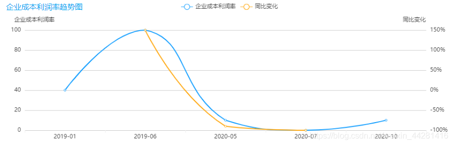
代码:
<template>
  <ve-line :data="chartData" :extend="traderExtend" :seetings="chartSettings" :colors="colors"></ve-line>
</template>

<script>
export default{
  data() {
    return {
      tableData: [],
      chartData: {
        columns: ['日期', '企业成本利润率', '同比变化'],
        rows: [{日期:'2019-01',企业成本利润率:'40',同比变化:'50%'},
        {日期:'2019-06',企业成本利润率:'50',同比变化:'60%'},
        {日期:'2019-09',企业成本利润率:'70',同比变化:'80%'}],
      },
      chartSettings: {
      },
      traderExtend: {},
      colors: ['#0E9CFF', '#FFA70D'],
    }
  },
}
methods:{
 initChartData() {
        this.tradeChartSettings = {
        yAxisType: ['KMB', 'percent'],//数据类型
        yAxisName: ['日均运量', '同比变化'],//y轴坐标轴的名称,在下面可以更改样式
      }
      this.initTraderExtend()
  }
 initTraderExtend() {
      this.traderExtend = {
        yAxis(item) {
          /* 右轴 */
          // 坐标轴名称的文字样式
          item[1].nameTextStyle = {
            padding: [0, 50, 0, 0],
          }
          item[1].splitNumber = 5
          return item
        },
      }
    },
}
</script>
关于“Vue怎么绘制双Y轴折线柱状图”的内容就介绍到这里了,感谢大家的阅读。如果想了解更多行业相关的知识,可以关注捷杰建站行业资讯频道,小编每天都会为大家更新不同的知识点。
本站采用系统自动发货方式,付款后即出现下载入口,如有疑问请咨询在线客服!
售后时间:早10点 - 晚11:30点
 服务热线 19970861797

 返回顶部
返回顶部